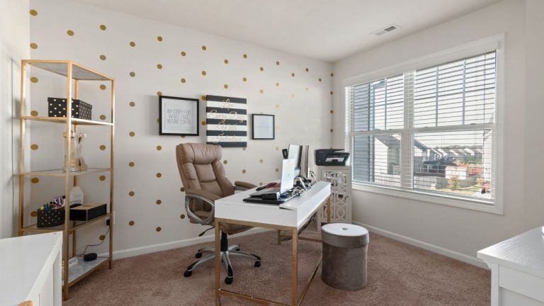
Is Blue A Good Color For Home Office?
Choosing the right color of paint for your home office is as important as designing other aspects of the room. But the right color can be different for everybody. And, there’s no such rule or guideline that you can follow blindly. That being said, blue has consistently been a favorite option for offices. But why is that? Is Blue really a good color for home office?
Blue represents peace and tranquility. At the same time, it calms us down during a hectic day of work. Our brain tends to associate blue with open sky and ocean. It naturally inspires deep or critical thinking and makes the place look more spacious.
The main goal of this article is to figure out why blue is a favorite color for offices. And, will it work for your home office as well or not? so, without further ado, let’s jump into it.
What Is The Most Productive Color For An Office?
If you spend time researching in your home office, you would love the color blue. It is a “cool” tone. And, such colors tend to soothe our brains while we think. That’s the reason, you should give it a try if you are an accountant, programmer, or any job that requires intense focus.
Blue by nature sends stimulants to our brain and wakes us up. You hardly ever feel drowsy for no reason under blue lighting. Have you ever noticed how you don’t feel drowsy while using a smartphone? Well, it’s because of the blue light emitting out of the screen. Corporates use this color theory all the time.
Most of the manufacturing factories, Research labs have lighting with a slightly bluish tone. It helps the employees focus better. That’s how corporates increase the productivity level of their workers. If you feel unmotivated or unfocused during intense work at home, you can also rip the benefits of the color blue.
Note: if you choose to use yellow or orange in your home office walls, try to use the lightest shades. Because a vibrant orange might be in your face all the time and would look quite over the top.
Is Blue A Good Color For Home Office?
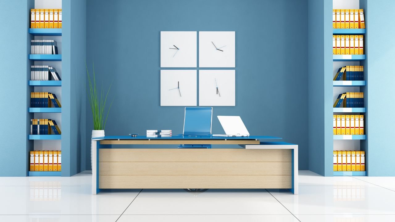
Blue is arguably the most appealing color for an office. That’s the reason so many corporate offices around the world are painted blue. It’s not random. There’s clear color psychology behind it.
Increases productivity Level
Since we are talking about offices, productivity is the most crucial factor. For high-paced workplaces, employers choose blue as the background color in their offices. You see, blue is on the cooler side of the color spectrum. As a result, it doesn’t promote intensity like red or orange. Instead, blue is claimed to lower blood pressure during anxiety.
Now, you know why most hospital rooms are painted blue. It soothes our vision and is contrary to the stress we feel in a workplace. Offices use blue tone to improve their worker’s performance during stress.
In short, it feels less stressful with a hint of blue on the wall around you.
Inspires Visionary thinking
Watching the sky or ocean is proven to calm our minds. It helps us think better. No doubt, we all have those deep thoughts sitting on a beach. Since blue is the color associated with both sky and ocean, we subconsciously feel calmed or relaxed around it. Hence, creative places are often painted blue.
Makes The Room Feel Spacious
Apart from increasing our productivity level, blue creates an illusion of extra space. It is especially true for remote workers. Most of us can’t manage a fully furnished spacious place to work. Instead, we get a cozy corner that hardly fits our desk and all the office equipment. Now, it can be very hard to sit in such a small corner and do creative tasks.
But, coloring the walls blue can solve this issue for you. It kind of blurs out your vision. So, the walls are not in your face. As a result, it feels like there’s more room, and you can avoid the stress.
Represents Trust
Each color on the rainbow triggers a special emotion in us. For example, red triggers anger, and yellow makes us cheerful. Same way, blue represents trust. If you notice, most social networking apps like Facebook, Twitter, and LinkedIn all have blue icons. It is to send a signal of trust in our brain.
You can do that too by painting the walls blue. Especially if you often held meetings, having blue walls would be a great start at winning the client’s heart.
Note: Don’t go overboard with painting everything in blue around you. That can minimize the original effect “blue” should have on your mind. So, be careful with that.
What Is The Best Color For A Home Office?
Blue, white or neutral shades work best for the home office. But it also depends on the type of work you do or the kind of environment you want to create. It even depends on the type of lighting you have on the ceilings. For example, if you want the place to look more creative, painting all the walls the same color wouldn’t be good. Try to use accents of different colors on the center wall. It will highlight that particular area and will give certain energy to the room.
That being said, not every color looks good with blue. For example, if you have a pale blue layer on the wall, don’t use vibrant red or orange. Because those colors represent completely different kinds of energy (passion, intensity, anger, etc). The rule of thumb is to pick warm colors to highlight another warm tone and vice versa.
Top 3 Colors To Pair Up With Blue
Even though blue looks perfect, you might not want the room to be 100% blue. That looks pretty boring. So, here we have some recommendations for you. Have a look.
Blue-Green
Blue and green are pretty close on the color spectrum. There are a lot of shades that are between blue and green. Both colors are considered cool and soothing to the eyes. Even though green has never been associated with productivity, it represents nature. And, nature calms us. Especially if you are a plant lover, having green tints on the wall will make you feel closer to nature.
Blue-White
This combination doesn’t require any explanation. White looks good with almost every color. If you want to play it safe stick with white. You can paint the edges white, to highlight the blue paint even more. Sky blue looks better with white than the other shades of blue.
Both blue and white encourage calmness. Plus, the use of white will make the room brighter than it used to be.
Blue-Grey
Blue and grey complement each other perfectly. Grey is a symbol of intellect. That’s something you might want your office walls to represent, right? Plus, grey doesn’t have a loud tone at all. It tends to highlight the furniture and other accessories in the room. If you think using only blue is not providing a strong or intense kind of vibe, try using grey with it.
Another color that looks amazing with grey accents is lavender. Although it is not blue, it inspires creativity and a feeling of peace. People also use lavender fragrances to improve their sleep quality. so, instead of going blue, you can try this shade for your home office as well.
Note: Using the lighting set up correctly can help you be more productive. Follow this article, to find out which color temperature you should use in a home office.
What Shade Of Blue Is Best For Office?
There are approximately 260 shades of blue. So, when we say that you should paint the walls blue, it’s not quite specific. Most designers suggest rich-blue colors like Prussian blue, and royal or navy blue for the office walls. If you don’t have the energy to consider all 260 shades, stick with this recommendation.
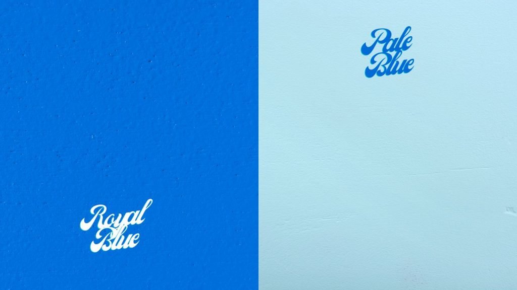
Royal Blue/Navy Blue
Even though royal or navy is a very rich and solid color, it’s a bit risky. You are supposed to get a “strict” vibe out of such colors. So, decide whether you want such a vibe or not. Royal blue looks amazing if your home office is
situated near a big window. Remember these “dark” colors tend to absorb most of your room’s lighting. So, it can take a few more bulbs to lit up the room to the desired level.
To balance out the darkness, try using light-colored accessories around the room. For example, you can place yellow cushions on the chairs or couches. This breaks the “dark” or “cold” monotony created by blue. Prussian blue falls in the same category as well.
Pale Blue
If you are not sure about the dark them, try a pale blue shade instead. Pale blue is very close to neutral grey. It blends in perfectly with any kind of interior you have. whether you have vintage or modern accessories, pale blue serves as the best background. The best thing about pale blue is that it doesn’t steal attention from any center pieces.
You can use dark blue accents on some portions of the wall if you want to make it interesting. White is another great option to mix with pale blue. It will instantly light up the whole room. The room might make you perceived as simple and disciplined. Unlike vibrant yellow or orange, it doesn’t look “too fun.” So, you must consider the type of vibe you are after.
Final Note
Why do we feel happier during autumn or more depressed during winter? It can be the presence or absence of color around us. Colors really influence our mood and there’s no denying that. in this article, we tried to figure out how the color blue affects our mood. In short, it gives off a calm and peaceful vibe during an intense work schedule. As a result, people tend to choose blue over other colors while painting offices.
That being said, never use a color you dislike. After all, color can help with boosting your mood as long as you like it in the first place.
With that, we are signing off. Hopefully, you have found the answers you were looking for. Thank you for staying with us.
![Can You Set Home Office In Your Bedroom? [Pros & Cons]](https://homethereby.com/wp-content/uploads/2022/05/Can-You-Set-Home-Office-In-Your-Bedroom-768x432.jpg)
![Vastu For Home Office [Office Desk Arrangement Tips]](https://homethereby.com/wp-content/uploads/2022/01/Vastu-For-Home-Office-768x432.jpg)