15 Kitchen Cabinet Color Ideas To Make Your Space Feel Brand New
I used to be a total devotee of the all-white kitchen (I still am). It’s clean, it’s classic, and it’s impossible to mess up.
But recently? My eyes have been craving a bit more… life. But I realized that fun happens when you stop playing it safe and start playing with contrast.
So, whether you’re looking for a gentle pop of color or a total kitchen transformation, these 15 kitchen cabinet ideas will help you blend those reliable neutrals with stunning new hues.
Kitchen Cabinet Color Ideas
1. Timeless White Cabinets for Ultimate Brightness
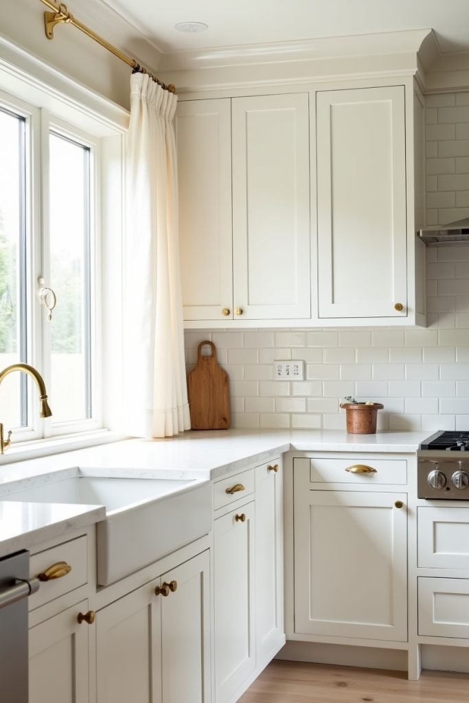
I truly believe white cabinets are the ultimate “undo” button for a cramped, gloomy kitchen.
It is the color that never goes out of style and manages to make even a tiny apartment galley feel like a sprawling estate. So, if your kitchen currently feels like a dark cave, this is your literal flashlight.
Is it a bold choice for parents of toddlers with sticky fingers? Definitely. But for that airy, high-end glow, I’d risk a few extra wipe-downs any day.
2. Warm Taupe Cabinet Is The New White
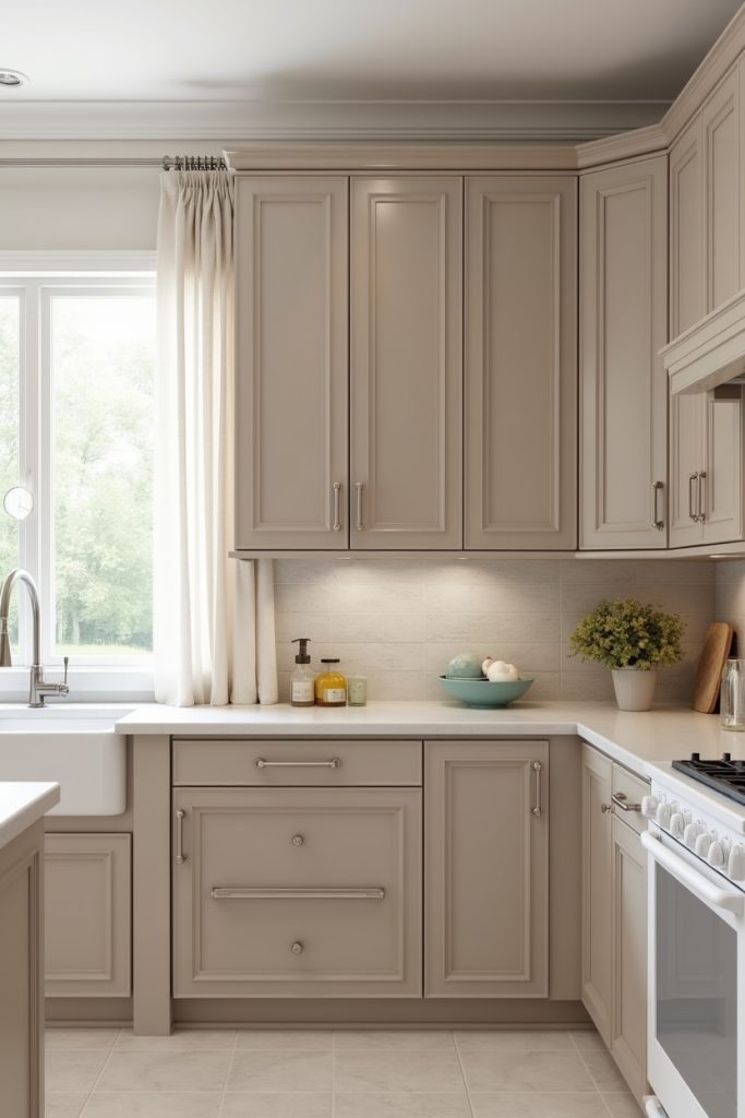
I used to be a white cabinet purist until I met warm taupe.
It is the secret weapon for anyone who wants the brightness of white without the clinical vibes of a surgery center. Think of it as white but with a soul and a cozy sweater. It works beautifully in bright kitchens because it softens those harsh afternoon rays.
Why settle for basic when you can have this unique, creamy depth instead?
3. Navy Blue Cabinets Offer Dramatic Sophistication
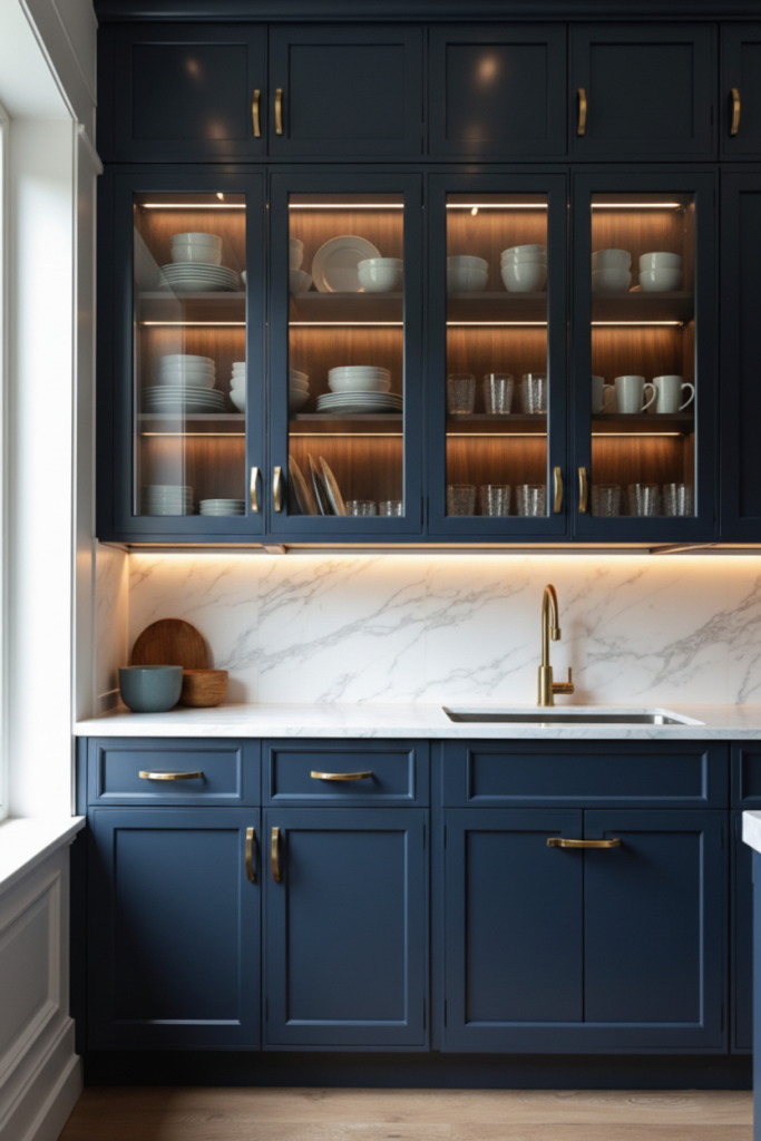
If you want a kitchen that looks like it belongs to someone with a secret wine cellar, navy is your best friend.
It is the sophisticated “adult in the room” of the color wheel. While white is busy pretending to be clean, navy looks expensive while hiding every smudge from last night’s pasta sauce.
I love how it makes brass hardware pop like jewelry. It works best with under-cabinet lighting to keep the drama feeling fresh rather than heavy.
4. Soft Dusty Blue Cabinets Redefine Coastal Chic
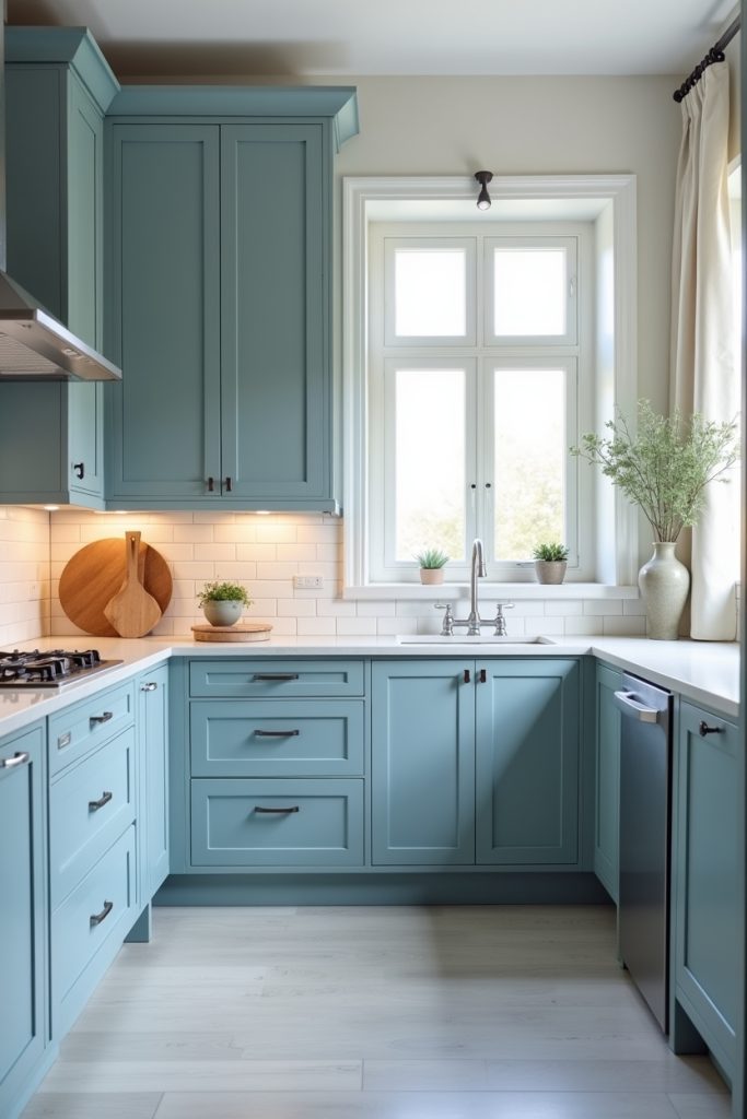
I’ve always thought of dusty blue as the interior design equivalent of a deep breath. And who wouldn’t want to cook dinner in a space that feels this calm? It is basically therapy in paint form.
This shade brings an instant vacation home energy to your kitchen without actually needing a beach nearby. It works like magic when paired with white subway tiles and light wood floors.
That’s why it is the perfect middle ground for anyone who finds navy too moody and baby blue a bit too sweet.
5. Muted Teal Cabinets Add Trendy Depth
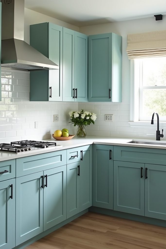
I know many people think teal was strictly reserved for 90s beach houses. But this muted version totally changed my mind.
It is the perfect middle ground for anyone who wants a real pop of color without feeling like they live inside a crayon box. This shade has just enough gray in it to look expensive and intentionally moody.
I also love how it makes simple black hardware stand out. It is basically the design equivalent of a perfectly tailored suit.
6. Ash Gray Cabinets Define Modern Elegance
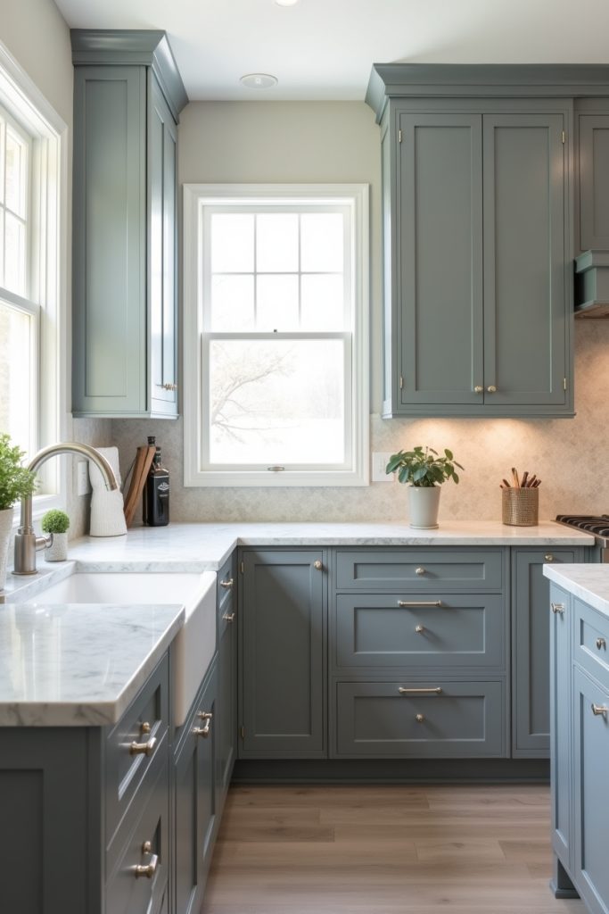
If you are stuck between “too dark” and “too light,” ash gray is your design soulmate.
These cabinets offer a grounded, organic feel that makes a kitchen look expensive without trying too hard. It is the kind of color that looks like it belongs in a high-end architectural magazine.
I love how it creates a serene, earthy backdrop for marble countertops and gold accents. And I don’t think anyone would like to settle for basic neutral when they can have this level of smoky.
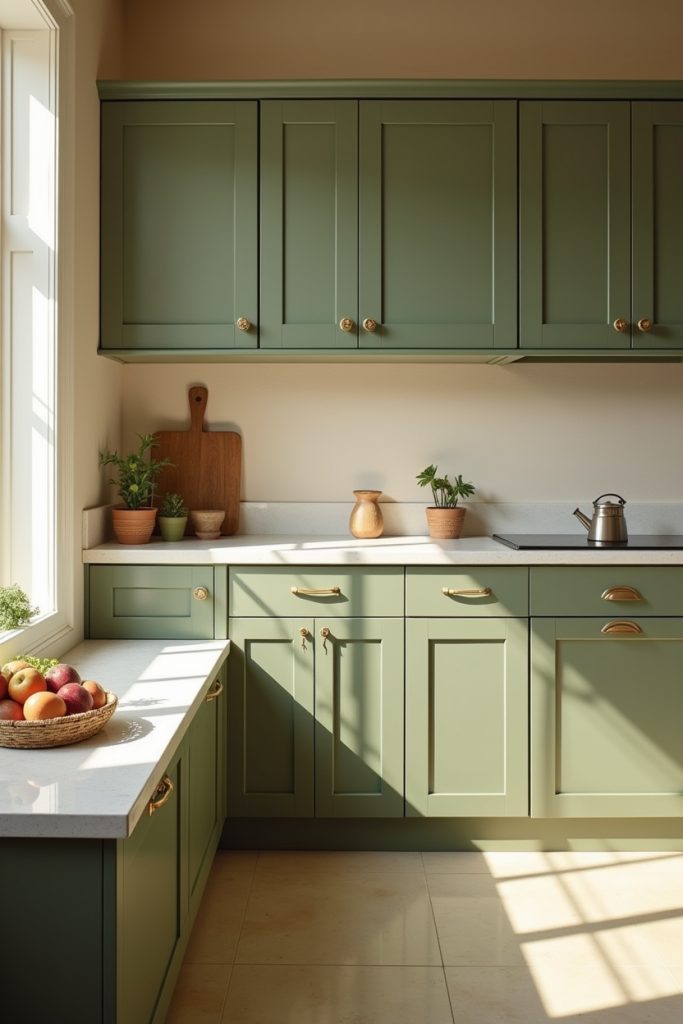
7. Sage Green Cabinets Are Nature’s Neutral
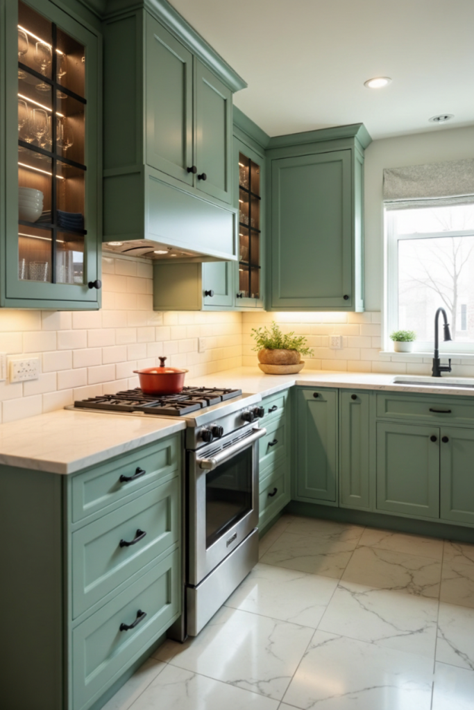
I am convinced that sage green is the interior design world’s favorite peace offering.
It is trendy enough to feel current, yet so rooted in nature that it acts like a neutral. These cabinets bring a soft, organic energy that makes your kitchen feel less like a chore zone and more like a high-end spa.
I mean, who knew a vegetable-inspired shade could look this expensive? It works brilliantly because it plays well with both warm wood and cool marble.
8. Olive Green Cabinets Bring Earthy Luxury
I used to think olives were just for martinis, but on a kitchen cabinet? It is an absolute game-changer.
This color is for the person who wants their home to feel like a permanent autumn afternoon in the Italian countryside. Is it bold? Sure. But because it is so rooted in nature, it doesn’t feel like it’s shouting at you when you walk in for breakfast.
And look how it makes gold hardware look like buried treasure. It is unique because it feels both historic and incredibly modern at the same time.
9. Soft Blush Cabinets Add Playful Charm
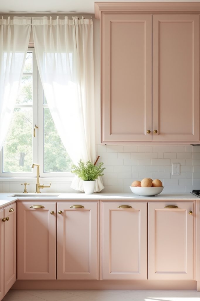
I know what you’re thinking: “Is my kitchen going to look like a nursery?” Absolutely not.
This shade is surprisingly sophisticated when you pair it with clean white tiling and those stunning gold pulls. It’s like a permanent sunset glow for your home that makes everything look editorial.
This works brilliantly in smaller spaces because it reflects light without being as stark as clinical white. It’s warm, it’s a little cheeky, and it’s a total mood booster for your morning coffee.
10. Warm Honey Oak Cabinets Radiate Cozy Minimalism
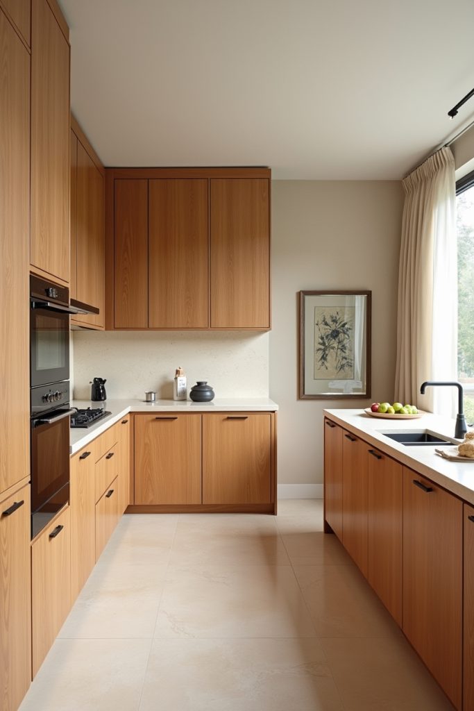
Warm honey oak cabinets are making a massive comeback. Why? Because they bring a grounded, organic soul to the kitchen that paint just can’t replicate.
It is the ultimate choice if you want that “Scandi-meets-California” vibe that feels expensive yet effortless. I love how the visible wood grain adds texture without cluttering the visual field.
This look works best when you keep the hardware sleek. And the black provides a modern anchor for all that golden warmth.
11. Burgundy Cabinets Create Bold Culinary Drama
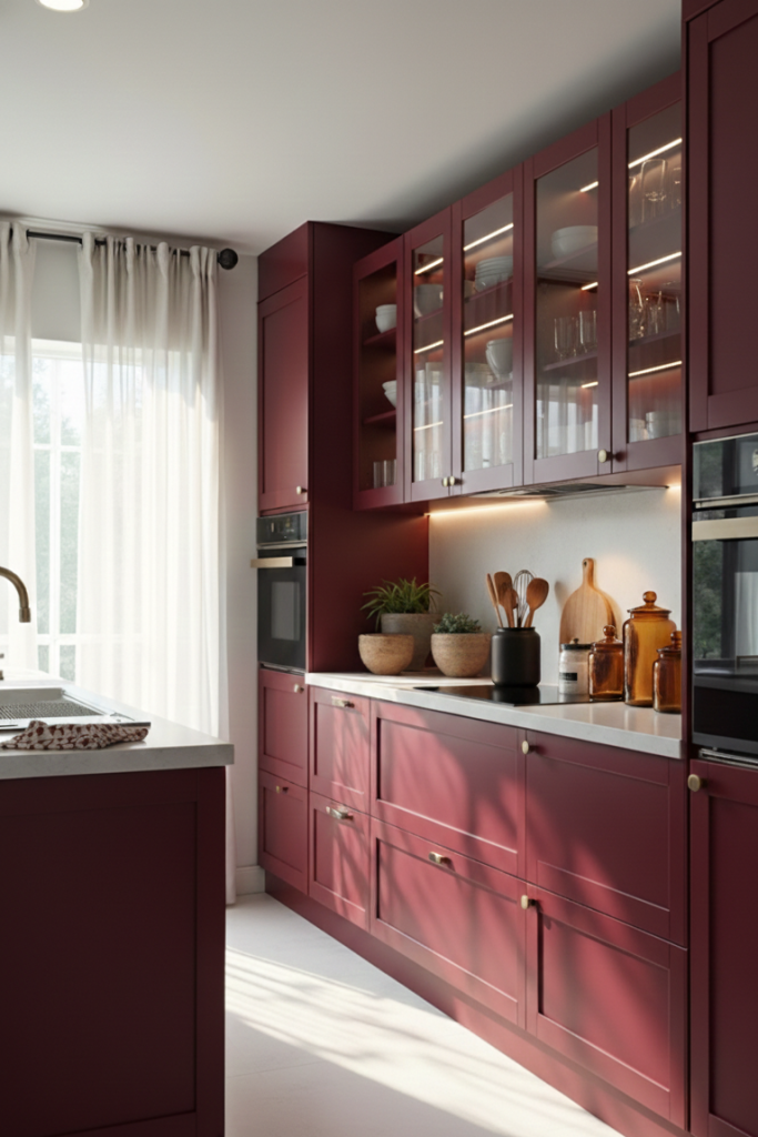
Why play it safe with beige when you can have this much personality? These burgundy cabinets bring a “main character” energy that most kitchens only dream of.
The depth is truly unique because it feels incredibly bespoke without the custom-build price tag. To keep the look luxurious rather than heavy, you can always pair this rich color with creamy white countertops.
It’s basically the design equivalent of a perfectly aged Merlot. Why? It’s bold, complex, and impossible for anyone to ignore.
12. Matte Black Cabinets Define Bold Elegance
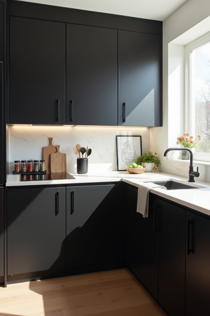
These matte black cabinets are the ultimate “cool kid” of design, offering a sleek, velvety finish. I love how it instantly grounds a bright space, especially when paired with white marble.
It is a unique choice because it manages to feel both incredibly modern and totally timeless at the same time. Is it daring? Absolutely. But for that level of sophisticated, moody luxury, I think it is a risk well worth taking.
It hides the chaos of a busy kitchen while looking like a million bucks.
13. Navy Blue and White Cabinets Balance Drama
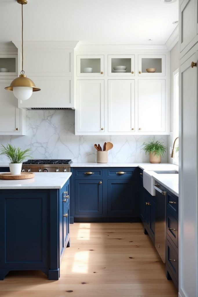
I get such a rush when I see a kitchen that isn’t afraid to play with contrast. Pairing crisp white uppers with deep navy lowers is the ultimate design “cheat code” for making a space feel grounded yet incredibly airy.
It’s a unique look because the dark base hides the inevitable scuffs of a high-traffic area, while the white keeps your ceiling feeling miles high. I love how it makes simple brass pendants look like intentional jewelry.
It’s basically the tuxedo of kitchen design: sharp, balanced, and effortlessly cool.
14. Maroon and White Cabinets for Bold Contrast
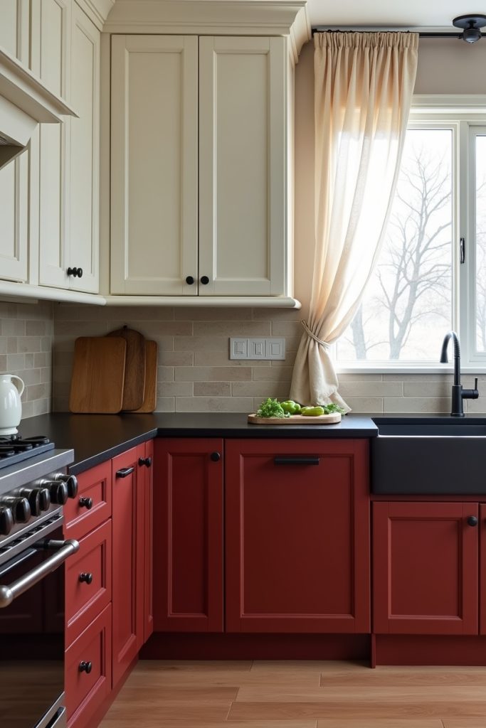
These kitchen cabinets break the neutral mold with something as luscious as maroon. I mean, why play it safe with all-white when you can ground your space with this delicious, wine-inspired warmth?
By keeping the upper cabinets creamy white, I find the room stays bright and open while the maroon lowers add a heavy dose of “cool factor.” It’s a unique strategy because the darker base is a champion at hiding the reality of a busy kitchen, like those inevitable toe-kicks and splashes.
I love how the black hardware gives it a modern, edgy bite. This combo is basically the design equivalent of a perfectly seasoned dish.
15. Matte Black and Honey Oak Cabinets Anchor Modern Warmth
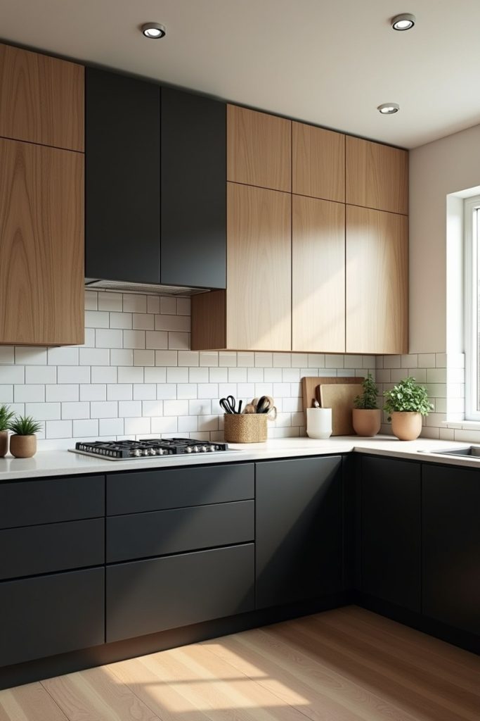
I hit a total design high whenever I spot a kitchen that balances “industrial cool” with “homey warmth” this perfectly.
Pairing matte black lowers with honey oak uppers is my favorite way to create a space that feels grounded but never heavy. The black adds a sharp, modern edge, while the oak ensures the room feels inviting for a Sunday morning breakfast.
It’s a unique strategy because it combines two major trends into one timeless, high-contrast masterpiece. I also love how the white subway tile acts as a clean bridge between the two, making the whole setup look like a custom architectural marvel.